
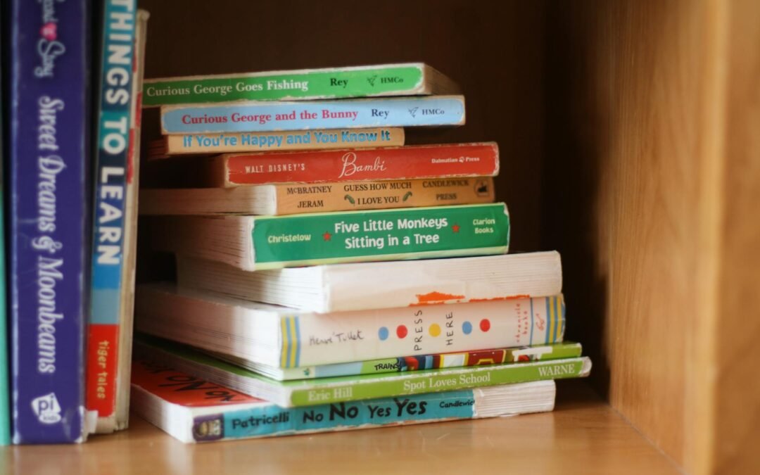
If you’re writing or publishing a children’s book — whether a picture book, early reader, or middle-grade chapter book — formatting can often be one of the trickiest steps. Many authors invest in illustration, cover design, and story, only to run into issues when layouts, trims, or print specs don’t line up.
In this post, we’ll walk through the most common formatting mistakes children’s-book authors make, why they matter, and how you can avoid them — so your book looks professional, prints cleanly, and reads beautifully.
1. Using fonts that are too small, too decorative, or too close to illustration elements
ne of the most frequent issues: choosing a font that looks beautiful, but when printed is difficult for young readers. According to a print-on-demand publisher, “using fonts that are too small, too big, or too scripty … makes it challenging for young readers.” MCRL Overseas Group
How to avoid:
- For picture books, aim for readable fonts (without heavy flourishes) and a size appropriate for your trim size (e.g., 18-24 pt as you noted in your Starter Kit).
- Ensure text doesn’t overlap illustrations or bleed too close to margins.
- Preview in print proof (and in black-and-white) to test readability.
2. Text placed too close to margins or binding edge
When text sits too near the inner margin (the “gutter”) or the book’s edges, it risks being trimmed off or becoming hard to read. This is especially true for children’s books where full-page illustrations condition the layout.
How to avoid:
- Check your printer’s required margins and bleed (for example, your Starter Kit included a 0.125″ bleed suggestion).
- Leave extra “safe” space inside the inner margin so text doesn’t disappear when bound.
- Always order a printed proof to inspect these areas.
3. Too much text on a page or heavy blocks of text
Children’s books often perform best when the layouts are clean, visually engaging, and paced appropriately. If you crowd pages with long blocks of text, you lose the flow and the space for illustrations to breathe.
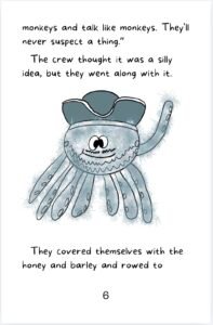
How to avoid:
- Use shorter sentences and fewer lines per page.
- Integrate visuals (illustrations, whitespace) to balance text.
- Consider reading age or early-chapter layouts to match the reader’s attention span.
4. Mismatch between orientation/trim size and content type
Choosing a trim size that doesn’t align with your story type (e.g., landscape vs portrait) can create awkward layouts or printing complications. Your Starter Kit rightly outlines standard trim sizes for children’s books (e.g., 8×10, 8.5×11 for picture books).
How to avoid:
- Decide early whether your book will be portrait, square, or landscape (this affects illustrations and text flow).
- Check print-on-demand services (like KDP or IngramSpark) for available sizes.
- Align your interior design and illustrations with your chosen size from the start.
5. Neglecting the end-product proofing and file export steps
Formatting a children’s book isn’t finished when you design the pages — the export (PDF) and proof copies are where errors often surface (e.g., image resolution too low, colors shifting, fonts not embedded).
How to avoid:
- Export as high-resolution PDF (300 dpi or higher) with fonts embedded.
- Order a printed proof or order from POD service before final release.
- Check illustrations, text placement, margins, bleed, binding edge, and color fidelity.
Related Children's Book Publishing Resources
If you're working on your own children's book, you may also find these guides helpful:
How Much Does It Cost to Self-Publish a Children's Picture Book?
The Ultimate Guide to Children's Book Sizes
How to Make and Publish Your Own Children's Picture Book
Conclusion
Formatting a children’s book well takes time, care, and attention to detail — but when you do it right, your book looks polished, reads smoothly, and stands out in the market. Avoiding these common formatting mistakes means fewer complications, less stress, and a better experience for your readers (and you!).
If you’d like a handy checklist to keep beside your next project, you can download The Children’s Book Formatting Starter Kit here by signing up for our newsletter either with the popup form or the form located on our Home Page by clicking here.
Happy publishing!
About the Author
Allie Compeau is an independent author and publisher who has created children's books, chapter books, novels, journals, coloring books, and other print-on-demand titles through Amazon KDP. Through WhistlePig Publishing, she shares practical lessons learned from creating, illustrating, formatting, and publishing books as an indie author.